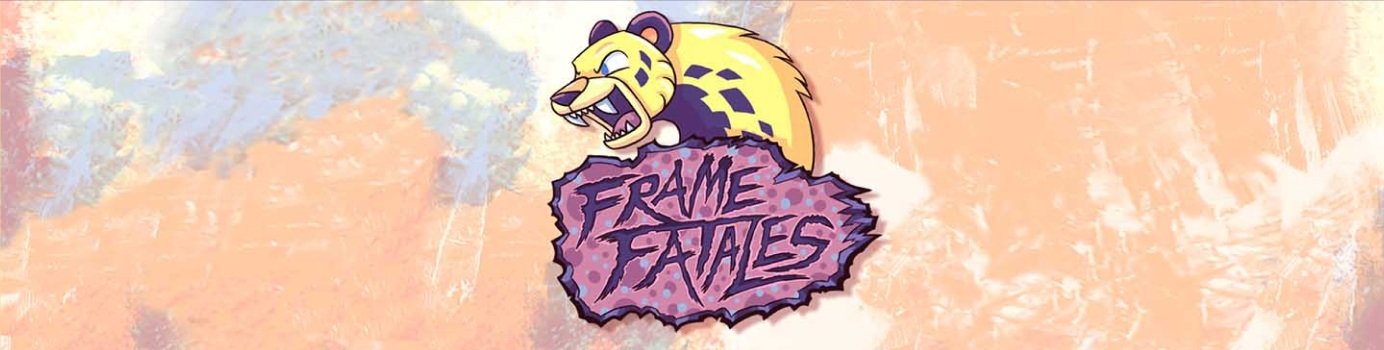

FF is an online charity showcase of all the best feminine presenting gamers. My team’s goal with this project was to create a site in collaboration with stakeholders to achieve the best possible product to their standards. This concept of this product was centered around conflict/resolution with our stakeholder’s goals for their brand identity.
To create a product based on stakeholder’s needs and raise awareness/participation in online charity events
Project Goals
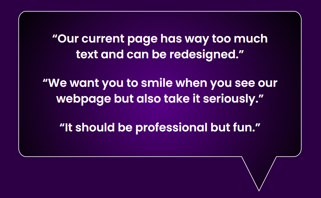
The stakeholders desire a welcoming and friendly product, however, require security barriers to participate due to gender regulations
The Problem
User Insight
”As someone who plays video games, I want to learn more about gaming charity showcases and how to participate in them.”
Research

What is Frame Fatales
Frame Fatales, a division of Games Done Quick (GDQ), hosts two annual charity gaming marathons. These livestreams feature participants playing games for audiences, with prizes and incentives to encourage donations. In 2025, GDQ has raised over $40M through these events.

Stakeholder Interview
Competitor Analysis

User Interview Results
Users answered the following questions:
Are you familiar with speedrunning?
Do you play games regularly?
Have you ever been involved in charity events?
Would you consider volunteering for a speedrunning event?
Interview insights:
Most users were familiar with speedrunning
Users have gamed before, but some believe it to be a waste of time
Some users have participated in charity events online
Users may be open to volunteering for speedrunning if they knew what it entailed
Survey Results
To expand our research to a wider audience, a Google Forms survey was completed by 61 respondents from 11 states.

Desktop and mobile are the most commonly used platforms for accessing speedrunning content

Users find out about charity fundraising marathon events most commonly from Twitter and Games Done Quick, accounting for 66% of awareness.
Design

Sitemap
As a requirement to participating in the events, users must submit a request to join the online server. This was a priority of the stakeholders in order to screen users for potential trolls and bullies who tend to target women in gaming spaces. To keep the “welcoming” tone, my team implemented many different avenues to easily access this request form.
Low Fidelity
We wanted as much information about how to participate in the event. There are two main showcases a year, along with some special events, a challenge my team faced was how to explain the different events and how their title refers to the time of year the showcase occurs.
We have to highlight that Flame refers to the Summer event and Frost refers to the Winter event.
Testing

User Testing Results
Research Questions
Will security barriers make it too difficult to join the community?

Do events with similar names confuse users?
Will it be simple for new users to navigate to the volunteer page?

Testing Goal
To understand the process and apply for a discord invite

Users understand difference between Flame, Frost, and Fright Fatale events
Users can successfully find, name, and describe a volunteer role
Success Rate
Mobile
Desktop


Stakeholder Feedback
Content Writing
Watching the stream should be primary CTA when events are streaming
Change the livestream heading convey action, change “Today’s Livestream” to “Watch Now!” or “Flame Fatales is Live!”
Use the word “Request” instead of “Apply” to make joining the community feel more friendly and approachable
Navigation
Separate events into to two pages: Main events (Frost, Flame) and special events (Fright Halloween event, etc.)
Move “Support Malala Fund” card closer to top, donations are the key CTA during events and charity should be featured more prominently to encourage users to research further into the cause they benefit
Iteration and Visual Style
Iterations Testing Results
Research Questions
Will security barriers make it too difficult to join the community?
Do events with similar names confuse users?
Will it be simple for new users to navigate to the volunteer page?
Testing Goal
To understand the process and apply for a discord invite
Users understand difference between Flame, Frost, and Fright Fatale events
Users can successfully find, name, and describe a volunteer role
Success Rate
Mobile
Desktop
After iterations we found that users were successful in our tests and our stakeholders were happy with the results pertaining to their goals
UI Style
Style Tile Takeaways
The stakeholder’s desired color palette, based on an already existing logo, had a lot of bright colors
We made sure the site was colorblind accessible and WCAG compliant
Typography had to represent the “fun but professional” tone per the stakeholder’s request
Final Product
Organization
Using provided visuals, we were able to reduce user confusion on the different events. The colors also emphasized the time of year each event represented without users needing to further search for the difference. We also made specific information readily available for those interested in participating.
Security Barriers
We created several different paths and options to contact the FF team about joining the online server, along with explanations why this is required. We also included bright colors and visuals to maintain the friendly and welcoming environment.
Conclusion
Future Iterations
Having separate homepages for whether or not the video feed is live
If we were to continue this project, my team would bring this design to larger leads of the organization and get broader feedback from their charity partners
We’d also start working with developers to start building specs for behind-the-scenes conditions and testing the site’s functionality within the event’s online scenarios
Pain Points
We had to remove a Community page that relied on a Twitter API, this API was free until recently and my team would need to meet with the stakeholders to discuss budgeting or an alternative feature to deliver their updates
We had to keep all members focused on the stakeholder’s goals rather than experimenting with extraneous features that took away from the stakeholder’s desires
Final Thoughts
Working with the Frame Fatales Leads presented a new opportunity to earn hands on experience with direct communication with a client
FF Leads felt we had accomplished their goals within our design and provided a quality product
They expressed that they felt all their needs were heard and enjoyed watching the site evolve as they were involved in every step of the process